Thursday, June 30, 2011

Installation Art

Relefection on installation art:

A. What is installation art?
Installation art is art that take over and redefines a space.  It's usually seen as trendy and always  three dimensional. This space can be entered, explored, experienced, and reflected upon.  Some Installation art, like "She Came In Through The Bathroom Window"  change the gallery space entirely. In this specific piece Richard Wilson removed an entire window from the gallery and used it in his space.
 B. What materials are used installation art? 
The genre incorporates a broad range of materials ranging from natural to media and technology.  Because the genre is so interpretative it wouldn't make sense to limit these imaginative artists to a certain media.
C. Why make installation art?
Artist make installation art because it forces the viewer to enter the environment. The viewer experiences an emotional connected to the artist's art which may not be possible in two dimensional art.
D. Which artist/installation did I find most interesting?
I really enjoyed Richard Wilson's piece in the art center in Stockholm.  He actually turned the entire building into a giant installation. He took a section of the building and rotated it backwards and forwards. Now the window come down to the people instead of people having to walk up to view out.  Richard changes the way the normal world works. Installation art helps viewers to see the world in a totally different way. 

Now, to make my masterpiece I sat down and thought about these questions:

A. From the material reviewed, is there a inspiration piece that I feel a connection with?
I really connected to the pieces that invite the viewer into a world that is normally private. Art that makes the viewer really think about who would live in this world. Like Richard Wilson's "She Came In Through The Bathroom Window" or  Ann Hamilton's "mantle" these installations make the viewer feel uncomfortable, almost like they are doing something wrong.

B. What theme do I want to explore in my installation? Refer to your textbook if you need to review Themes of Art. 
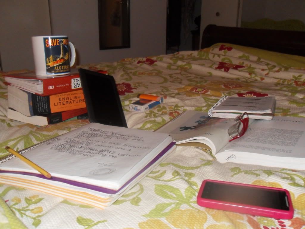
I'd like to explore the theme of self, and maybe some media in my installation.  I wanted the installation to reflect me and my expressions of frustration and stress during "late nighters", which is what I want to portray. I wanted my piece to make the viewer feel the anxiety of being a college student, and also maybe a little bit of the fun too.

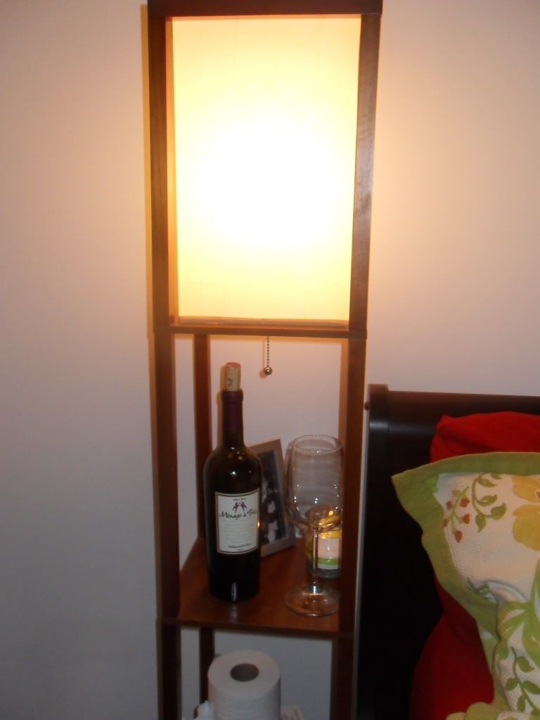
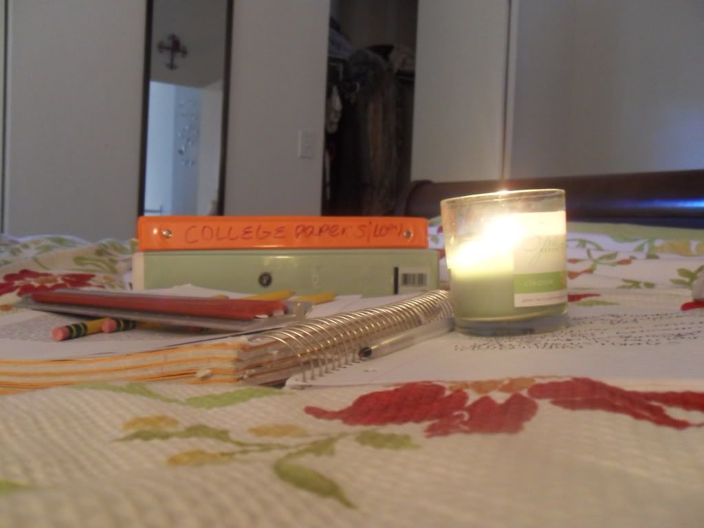
C. What materials will I use? I'm going to use common household items to re-create the scene of studying for a large exam. Glass, books, cloth, etc

D. Where will this installation be located and why? The installation is located in a bedroom because that is where the subject would be living this installation- if it had come to life. If my installation was in a gallery I would create it in a boxed in room in order for the viewer to get the overall feeling of being up all night studying for an exam. 
I hope when viewing the pictures you can understand the overall experience I was trying to create. It certainly made me feel stressed creating it!


Photobucket
Photobucket
Photobucket
Photobucket

Saturday, June 25, 2011

Albright Knox Visit


Freida Kahlo 
SELF PORTRAIT WITH MONKEY 1938
Oil on Masonite 
image.jpg
Vincent Van Gogh 
THE OLD MILL 1888
Oil On Canvas
image.jpg
Andy Warhol
100 CANS
Oil On Canvas
piece-vibert-marvelous-sauce.jpg
Jehan Georges Vibert

THE MARVELOUS SAUCE, CA.1890
oil on wood panel 

image.jpg
Sol Lewitt
 WALL DRAWING #1268: SCRIBBLES: STAIRCASE 2010 
Graphite on three walls
image.jpg
Nikki S. Lee

THE HIP HOP PROJECT 2001

Chromogenic color print
image.jpg
Pablo Picasso
LE TOILETTE
Oil on Canvas
image.jpg
Edward Hicks 
PEACEABLE KINGDOM
Oil On Canvas
image.jpg
Liam Gillick
EXPANDED PRODUCTION HORIZON
Powder-coated aluminum and transparent Plexiglas

 A.) Which artworks make an impact or impression on me? Why?The artworks that made an impression on me were really everyone that I saw! But if I had to choose 3 I'd choose: Sol Lewitt WALL DRAWING #1268: SCRIBBLES: STAIRCASE 2010, Liam Gillick EXPANDED PRODUCTION HORIZON, and Nikki S. Lee THE HIP HOP PROJECT 2001. Lewitt's and Gillick’s pieces made an impact on me because of their size and placement. I really thought it was interesting to observe and analyze art pieces that were on the walls and ceilings. It made the art feel less intimidating because it seemed like a part of my world. When art is behind glass or in a very expensive frame it holds a demeanor that makes the viewer feel humble around it, which in many cases is the correct feeling to have! Yet, these two artists bring their art to a more approachable level by placing them in common areas of view. I also chose to feature Sol Lewitt’s piece because we learned about it in this class and I thought it was neat to see it in real life. Nikki Lee’s piece The Hip Hop Project made an impact on me because I thought it capture real life. She didn’t want to glorify or cover-up the life of hip hop she chose to show it in its rawness and I thought that was really interesting. 


B.) Which artworks do I feel a connection with? Why?

I felt a connection with the works:
Andy Warhol 100 CANS, Jehan Georges Vibert THE MARVELOUS SAUCE, and Edward Hicks PEACEABLE KINGDOM.I love Vibert's the marvelous sauce because it reminds me of my best friend's family. I spent most of my younger years at my best friend's house. It was perfumed like a meatball and there was always food in the fridge. This painting makes me feel happy, and even brings a little laughter. Peaceable Kingdom is a really cool piece because it portrays balance between objects that aren't usually in balance.I felt connected to this piece because I liked his idea. He tries to bring things together that normally shouldn't go together and I feel like I do this a lot. For instance, because of my interest in literacy I am constantly trying to introduce non-readers to books. Although, they may not initially be comfortable with reading a book- if there is a connection it is an awesome experience.  I picked Warhol's 100 Cans because I think it was a piece that really changed art. Warhol is known for introducing pop art into the art scene and he is truly seen as an art radical. I connect to his piece because I feel like I try to constantly bring the future into teaching and want to always integrate new ideas into the classroom.


C.) Which artworks would I like to know more about? Why?

I chose
Pablo Picasso: LE TOILETTE, Freida Kahlo:SELF PORTRAIT WITH MONKEY,Vincent Van Gogh: THE OLD MILL as paintings I'd like to know more about. Most people known who Picasso and Van Gogh are and some of their most famous paintings. I have studied these two artists before and find their stories fascinating. I'd love to study their history more and become more knowledgeable about their styles. I thought it was really cool finding another piece at the Albright Knox that we have studied in this class. Kahlo's Self-Portrait with a Monkey is a really interesting piece. I don't really find it ascetically pleasing and I really think if I was painting a self-portrait of myself I'd try to make myself look the best I could. I'd like to find out what Kahlo's reasoning was for giving herself a uni brow and her fascination with animals.


Friday, June 24, 2011

LOGO

Photobucket

Photobucket

Photobucket 
1. Discuss what you thought about creating your logo.
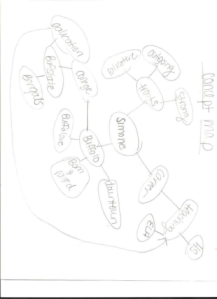
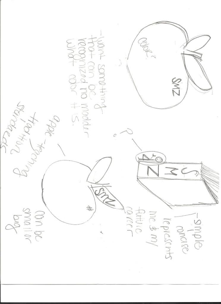
When I first starting thinking about my logo I started with a concept map about myself. I listed traits, where I lived, my career and then began to get more specific. The concept map really helped me to see what's important to my life, and what would be significant to represent.
2. Describe the process: creative thinking skills and ideas you used in the logo creation.
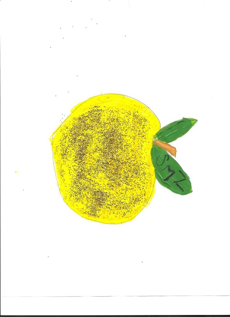
First I made a concept map. After creating the concept map I realized that since the close to my college career is coming quickly my career will be the very next big step in my life. I wanted to create a logo to represent who I am as a teacher. I started with sketching and quickly came up with the idea of a big, healthy apple. I toyed around with the idea of a book but I thought the apple was more simplistic. The father of the kids I nanny for is owns a printing company, so he deals with logos every day. He said the most important thing for me to remember is that a logo should be simple, memorable, and easily connected to what it is supposed to represent. Since the apple is already a symbol for teaching, I decided to build on that. I made the apple gold and sparkly because I think gold represents excellence and that what I strive to achieve for myself and my students. My initials are on the leave going upwards because I learned from the PowerPoint the anything pointing up means growth and nurturance. I wanted to include my initials to make the logo standout and represent only me.
3. What was the most important discovery you made in the creation of your logo?
During the creation of my logo I realized how important a logo really is. I looked at a lot of logos for different companies and realized what an impact they truly make. Logos are everywhere and they act as a reminder for consumers to buy from the company. Hopefully my logo will remind principals to hire me!
4. What is the most important information you learned from watching the videos, PowerPoint, and reading material  for this project? What is your opinion of the videos?
I really enjoyed the videos, I thought it was interesting how infatuated the man was with finding the right logo for his company, and how many rough drafts they went through to arrive at just a small, red, repeating circle! Also, The PowerPoint reminded me of how symbols truly morph what the mind is thinking. I thought it was interesting that viewers can get a sense of empowerment or nurturance from seeing a logo move upwards.

Friday, June 17, 2011

10 Step Value Scale/Color Wheel

Photobucket


Photobucket 
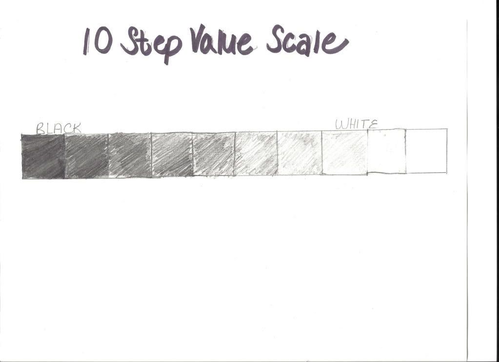
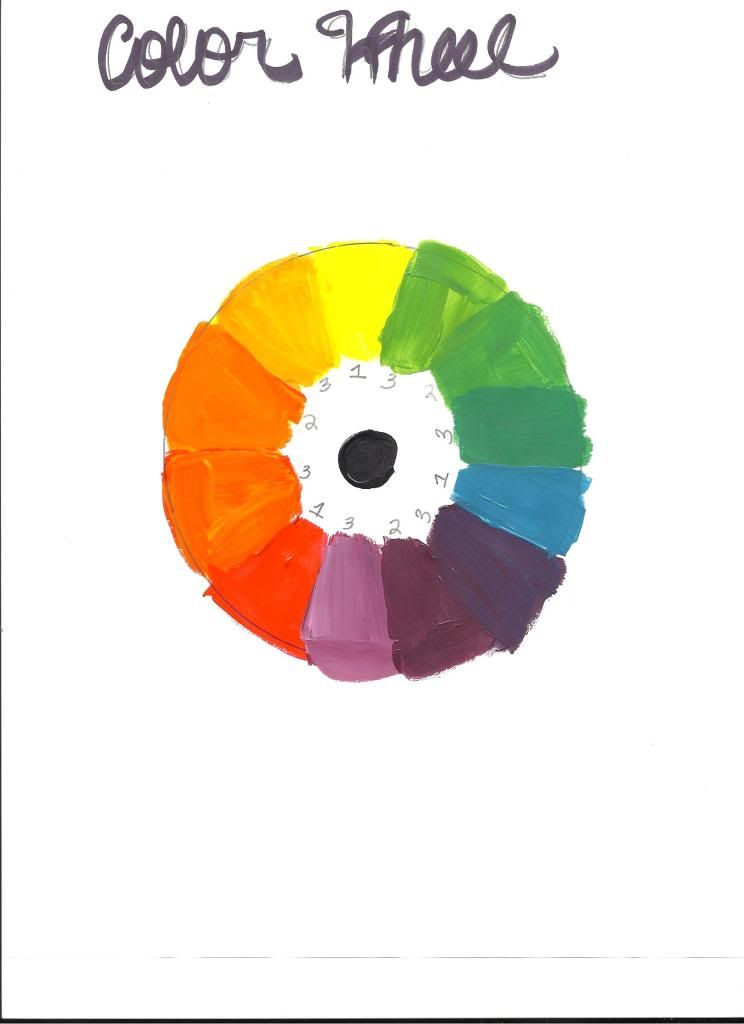
I thought these projects were going to be easy, but in actuality they required a lot of thought and time. I think these two projects help me to understand the variations of color and medias. The 10 step value scale made me see the range of light and dark that a pencil could obtain. It was harder to obtain the lighter shades of the scale. The color wheel helped me to understand paints. I really enjoyed working with the acrylic paint. It was really interesting seeing the colors change before my eyes. I actually tried to paint some creative when I was done with the color wheel because all of the different colors on the plate were inspiring. I thought the videos were educational. I found the man's voice in the scale video very monotone-but that's beside the point. I thought his video was very informative, I could actually follow step by step. The color wheel video was less informative, I used the book when making my color wheel rather than the video because it was just too hard to follow, especially with no sound. I feel that the most important discovery that came out of this project is that light and color affect the way a piece of work is viewed and it's imperative to recognize the different effects of color and light. 

Friday, June 10, 2011

photography project

Here is a link to my photo bucket slideshow: http://s1094.photobucket.com/albums/i457/zinnsm01/?action=view&current=be153219.pbw

This project was particularly intriguing to me. I was really excited about being able to use photography to express myself. After spending time reading and studying the elements and principles of design I realized that capturing these photos to represent the elements would be much harder then i first imagined. Although difficult I enjoyed the thought process that it forced me to go through. I had to not only think about the subject of the photos to make sure they fulfill the requirement but also make sure the photo was ascetically pleasing. I choose the pictures I did not just because they withhold the elements and principles of art but because they represent important times in my life or passions of mine. I enjoyed taking these photographs and becoming more involved in photography. I have always wanted to pursue photography at a more dedicated level and this project gave me a chance to understand the basic principles of it. One of my favorite photographs may have to be the picture I took for pattern. Sunflowers represent happiness, love, and unity. I feel that my life wouldn't be where it is today if I didn't live by these principles. So the picture of Sunflowers represent the quality of life I try to live. I also enjoyed fulfilling the "color" element of this project. I love shooting flowers so it was fun to try and find the brightest flower I could find and capture it's beauty through a lens. I hope that I can give a glimpse into my life and personality through this slideshow. I tried to capture photographs that could tell a story about not only the person/object in front of the lens, but also the person behind it.

Thursday, June 9, 2011

color and emotion.


Questions and Topics for Your Blog Posting:
1. Describe Color and it's effects on emotions. Use the appropriate vocabulary of color in your posting.
2. What is a theoretical aspect of color that most intrigues/fascinates you? Why?
3. In the Color video, what made the biggest impact on you in regards to color and it's effects on emotions?
4. In the Feelings video, what made the biggest impact on you in regards to color and it's effects on emotions? 

1. In the video the artist connects color to feeling. The video talks about a painter, Mark Rothko, who created works of color that were specifically created to evoke emotion. He used dark reds and maroons in hopes to create the feeling of rage. Rothko mades these paintings because he hated the four seasons restaurant, which originally asked for the paintings, and wanted the diners to feel trapped.  Color has a deep psychological meaning for the human race. Color  is used to create emotion. For instance, a stop sign is bright red because  it is a color that evokes alertness. We see a red stop sign and we know to stop. We obey when we see the bright red signs.  I feel that color is able to effect emotion because color acts as a description to a piece of art work. It leads the viewer into the direction the artist wants them to feel. If a painting was painted in dark blues and blacks, we would feel melancholy and sad. If a painting was painted in bright yellows and pinks we may feel a sense of happiness when viewing the piece of art. 

2.  I would say the theory that color effects emotion remains the most intriguing to me. I think that it is interesting that even though everyone is an individual, our brains process color in someone similar ways. The psychological use of color in order to provoke feelings of emotions is a mystery that I'd really love to explore more deeply. 

3.  I think the portion of the video that feature Mark Rothko's paintings really made the biggest impact on me. It intrigued me that he was so enthused to make paintings that evoked feelings of claustrophobia and anger. He knew the affects of color and wanted to use them to his own advantage- and it worked. The paintings were never feature in the restaurant due to actual fear that dinners would feel uncomfortable around the large dark red canvases. 

4. I thought Franciso Goya's story was particularly interesting. I was interested in how disease may have contributed to his change in color scheme in his works. After recovering from an unknown disease his work got darker and more mysterious. This change could of been formed from a reaction in his brain after his sickness, or also because of his belief in the revolution and his desire to represent his political views. I thought it was interesting to learn about how color completely changed Goya's artwork.